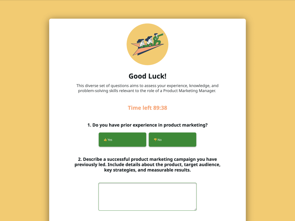
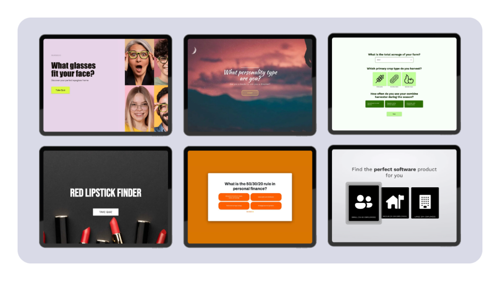
If you're trying to sell anything online, you know the importance of lead generation. Leads comprise of those who might be interested in buying your service or products. Capturing leads requires increasingly more creativity as online consumers become more cautious when leaving their emails. We reached out to 17 lead generation pros and collected their advice on optimizing forms and maximizing conversions on lead pages.
17 Lead Generation Pros and Their Advice
1. Chris Sloane, President, Heaviside Group
To get the most out of your lead gen and forms pages you need to give the visitor a very strong reason to convert. Getting email opt-ins is very competitive now, everyone is going for that and most people really don't want another annoying autoresponder sequence cluttering their daily inbox.
Therefore what you are offering as a lead magnet must really stand out and provide huge value to your target customer. It has to be unique and dialed-in to the problem that your customer needs to solve. It should ideally even get them started on the solution journey with enough value to get something important done for them, while also showing them they should really rely on an expert to help do the job correctly.
Build your forms and lead pages around these concepts, and your opt-in rates should soar and your lead quality should be much greater as well.
2. Brandyn Morelli , Founder, Tilt Metrics
We use lead gen forms on both Facebook & Linkedin for our B2B clients. With lead forms, it's always a balance between getting a low cost per lead, with reducing the number of unqualified leads you have to rifle through. What we do is to have 3 fields - Name, Company, Email.
Since on Facebook, most leads come with their personal email (since it's tied to their account), we found that adding a Company field helped us identify real leads drastically quicker. We then sync our list directly to a CRM where we validate emails using either Hunter.io or Neverbounce to reduce sending out bad emails.
“Test 2 creative variations (video vs still image is a great test), along with 2 copy variations.“
Another thing we recommend is to test 2 creative variations (video vs still image is a great test), along with 2 copy variations (we use a short version that's punchy and to the point, along with a longer version that's more story-driven). We've been able to drive down our cost per leads considerably having these variations to test through.
3. Elliott Davidson, Founder, Contrast Digital
There are two ways to tackle this, one by creating a very basic form with fields like name and email to keep the barrier to entry very low. This way you can get more basic form submissions, obviously the only thing with this data is that their intent won’t be as high and may not convert as much.
Whereas if we go to the other end of the spectrum and create a form with various fields and multiple questions to ensure they actually are interested we can find out more about their needs. For example putting a pricing field in your form and asking them about what their monthly marketing spend is, we can actually know what they are currently spending and if it is something worth spending time on.
Another great tip is to make sure you have a response form set up to the back of the form so when users submit the form they receive an automatic email back stating that the company has received the email and they will be in touch after so many days.
4. Joe Robinson, Founder, Green Flag Digital
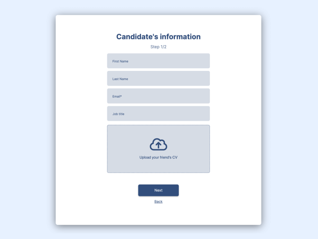
I'm in love with multi-step forms. They play directly into the visitor's psychology of not wanting to waste their time and fully committing to completing a longer form. By making the form multi-step, the conversion rates typically skyrocket.
The secret is to show value upfront on your landing page and your form. You show value on the landing page by addressing the visitor's pain, painting the picture of the dream solution for that pain, and then offering the fix. This is carried over to the form by asking questions about the visitor so it shows that you're truly listening to them and you truly care.
Instead of just asking for a name and email upfront, which can be invasive, you're asking pointed questions to get to know them better before going in for the ask in step 2 or 3 of the form. It's a win-win for everyone and a better way of generating quality leads.
5. Jason Berkowitz, SEO Director, Break the Web
When creating your landing pages, keep in mind that nothing inspires confidence like a good design! Ensure that your text is easy to read, and the colors harmonize well with your theme. Clear, easy navigation is crucial, and be sure to highlight your CTA so users know exactly what you want them to do.
“Make sure your forms stand out from the rest of your page. Use attractive colors and offer a clear value proposition. Simple is always best. Keep questions to a minimum and use checkboxes whenever possible.“
Adding customer testimonials to your landing pages or next to your form is another great way to boost confidence. Don’t just talk about what you do, talk about how you can meet your customer’s needs. A/B testing is crucial when it comes to lead generation. Compare different versions of your landing pages and forms to see which ones produce the best results.
Finally, if your form is multistep, avoid asking for the personal details right at the start of the form. Users are more likely to submit their personal information (name, email, etc.) after they've submitted other specific details. This helps keep conversions high and kept the customer's needs/wants at the forefront of the form.
6. Michael Costin, Founder, Local Digital
My favourite tip for lead forms may be counter intuitive. A lot of advice is to cut back on the number of form fields to remove friction and make it more likely for people to get in touch. Time and time again I have actually seen the opposite work though!
People are all too often threatened by entering their private details in a form immediately, as they know all too well a salesman is likely to call as soon as they submit the form. So a form that focuses just on trying to capture their name, email and phone number might not convert the best. It’s also a horrible way to qualify the leads.
The better approach is to set your form up to gather some information from the person about their unique circumstances. So, for example, if you’re an air conditioning company you might ask them how many rooms in their house, how many people will be using the system etc.
This is much less of a commitment than giving their personal details first up, and it also signifies that whatever they get back will be personalised to their needs, so it’s probably worth submitting the form. It’s also a “micro commitment” – by entering their answers they have already committed to giving you some information. When you then ask for their name and contact details as the second step they’re more likely to do so.
I’ve seen this play out many times with forms, so less is definitely not always more.
7. Nick Kanter, Director of Operations, Smash Digital
CTAs are arguably one of the most important parts of any lead generation page or form, yet we often forget to focus on them, and pour everything into the copy of the page itself.
The call to action you craft needs to be enticing, clear, and stand out on the page: this means you need to format it cleverly, turn it into a button, have it contrast with the rest of the page, but still keep it short enough so as not to take up too much space.
Make sure the benefit you are offering the lead is clearly visible somewhere near the CTA - as that will also encourage more clicks. Enforce points such as privacy and value.
Also, if you are making the CTA clickable (which you should), make sure it not only leads to the right page, but that you also keep track of the clicks that are coming through. This way you can monitor your conversion rates properly.
8. Amanda Thomas, Partner, Konstruct Digital
A lot of work goes in to well crafted landing pages. The value you squeeze out of a lead gen page can make or break the ROI of a campaign.
Keeping your landing pages focused on one conversion offer seems to be a general consensus best practice for optimizing conversion rate. The theory being that with the choice paradox, too much choice results often in no choice being made.
But what can you do with all the people that didn't convert? The good news is that now is the opportunity to offer all those conversion points you couldn't include on your lead gen page.
“Our best tip for getting the most out of lead generation pages: Keep the interest of people who didn't convert.“
My favorite approach to this is 2 pronged: (1) Exit lead capture, and (2) Retargeting.
Exit Lead Capture: Some people hate these, but you know what? That user is already leaving. Maybe they're interested but the timing isn't right. The offer could just be wrong compared to their timing. Exit pop-ups are an excellent time to present a softer-conversion point without weakening your lead-gen page offer.
Retargeting: It might seem obvious, but it still surprises me how many companies don't do this, or don't do this well. Retargeting ads to users who didn't convert can be a great opportunity to test out different offers and get the lead in your funnel another way.
9. Jordan Choo, Managing Partner, Kogneta
We do a couple of things to really squeeze out the full potential of our lead gen forms, two big tactics that we use are:
Pre-populated Form Fields Based on Previous Data
If you're sending any type of warm traffic to your site whether it be newsletter subscribers, current or old leads, webinar attendees or anything else you should be pre-filling the forms on your site with data that you already have on them. Some companies do this natively but, if yours doesn't you can easily do this with some quick Cookie + JavaScript work. We've found that conversion rates have significantly improved since you're dramatically reducing the amount of work a potential customer needs to put in trying to sign-up.
Use Digestible Forms
I can't tell you how many times I've seen companies have way too many form fields asking for people too much right off the bat. This completely tanks your conversion rate since it can seem extremely daunting and can come off. What we do instead is create multi-step forms using something like involve.me to help reduce visitor anxiety and break up the form into bite-sized chunks. We'll ask non-personal questions first to ease them into getting started and then backload the personal information questions (i.e. name, address, phone, email).
10 .Kevin Hilton, Director, Multi Layer Media
Make sure your leads are being sent to a CRM as well as your email. With CPC’s increasing on most PPC platforms it is more important than ever to optimise towards lead quality not just lead volume.
Not every lead you receive will be worthwhile pursuing and overtime there will be clear definitive data patterns in what is driving your best leads that produce revenue and those that do not. This could be patterns in keyword data on Google, or trends in demographic data on Facebook/Instagram.
If you use a CRM to manage your leads it means you can get your sales team to rate the leads or assign revenue to them. This allows you to optimise towards quality leads in future, rather than focusing on volume.
Both Google and Facebook offer the option to import “offline conversions” which makes the above possible, there are manual options for completing the uploads through each respective interface, however our recommended way to approach this is to automate the process by connecting your CRM to the appropriate API.
11. Stephen Sumner, Founder, Optimize Agency
Over time, things like Google Ads are generally getting more and more expensive and competitive to run, SEO is getting harder and taking longer to get results, so making the hard-earned traffic you have work for you is a primary area of focus for our business.
On lead generation pages and forms we like to put ourselves in the minds of the users and think about common objections, things that add confidence and items that add friction to the process and then optimise the user experience from there. One example might be to add industry accreditations and awards close to your lead form to instil confidence, another might be reducing or combining form fields.
Also, getting rid of pop-ups on pages that already have forms or primary conversion points, it's surprising how many sites use pop-ups carte blanche across their sites without thinking about how they can be damaging to existing lead generation efficiency.
12. Yuri Burchenya, Cofounder, Getfound XL
Use bold, contrasting colors and make sure buttons look like buttons. Pay special attention to on-hover element behaviour, often this aspect is untested. Call to action really should stand out, so use arrows, or people looking at, maybe even people pointing at CTA.
One advice that is often ignored is that of removing navigation menu. Great landing page works best on its own. If you’re concerned the page does not explain your product or company well enough, it’s a problem that needs to be solved on the landing page, and not by including links to homepage or other pages.
“Design for the devices most people are actually using, not for your own iPhone or MacBook.“
Finally, ask people not familiar with your company to spend 5 seconds on your page. If they can’t tell you what you’re offering after that time — probably you need to re-write your copy.
13. Tom De Spiegelaere, Director, Mango Matter Media
For us, the main thing we focus after doing the basics like short forms, super-simple questions that aren't too long, decent imagery, etc... is social proof. We like to use both social share counts + testimonials to max out our trust as much as possible.
And if you can, use actual faces with your testimonials, we want the visitor to be able to relate to those testimonials ("Hey, this guy is just like me" type thing).
One last tip might be an obvious one, but we still see a lot of people forgetting this one. Change the default "Submit" on your CTA or form submission button. Make it resonate with the target audience... if they're young and you're targeting a specific industry that has its own lingo, try and integrate it.
We want people to be excited when they hit that button, the use of active commands and exclamation marks works well here too ("Aight, Let's Do This!")!
14. Brad Smith, Founder, Codeless
The best lead gen form tactics depend heavily on the kind of business you're in:
- Low-priced, transactional sale with a free trial? Make it as frictionless as possible. Copy and paste all of the best CRO hacks like the less form fields the better, etc.
- But a high-priced, consultative sale with no low barrier to entry? Do the exact opposite. Include more probing questions, like budgets or head count to qualify your leads. And/or require a little skin in the game in the form of a credit card on file.
The former's onboarding flow should be largely self-lead, while the latter should include live interactions with a rep. The former's profitability doesn't cover what the extra touches cost. While the latter's high lifetime value (and similarly high cost of acquisition) means you need to put extra effort into each qualified lead that comes your way.
Each funnel works, but only if you match the tactics to the right context.
15. Curt Storring, Founder, Floor500
Your lead generation pages should be as much about ensuring the wrong people don't sign up as they are about making sure the right people do sign up.
That means getting very specific and setting expectations right up front.
“Your time is much better spent closing leads that actually want what you're selling. If your pipeline is clogged up with people who aren't qualified, you'll waste a ton of time and resources.“
One example on the agency side is to have a field asking about your client's marketing budget. You might think this would scare people off, but it'll likely only scare off the people who are too price sensitive to work with you anyway. This ensures you're getting leads that can actually afford to work with you before you put in all the groundwork of setting up a call and researching the client.
To make the most out of this, set up a follow up sequence targeting people who selected a range lower than what you normally work with, and send them something of value so they come back to you when they can afford to work with you. For example, send them a link to your course so they can learn to DIY what you're offering, or send them some of your best blog posts explaining how you do what you do.
Providing value like this increases the chances that they'll come back to you when they're ready, and also increases the likelihood that they'll refer you to other people.
16. Nick Eubanks, CEO, From The Future
So what I've found to work best is actually to map the UX of the form to the audience and benefit. So for financial-focused leads, for example loan (whether personal or business), since they require so much information it's best to break them up into "stepped forms" so the user feels progress and doesn't get overwhelmed with a wall of fields to complete.
For an older audience, the forms actually work best when they're ugly and use very simple UI components like plain radio buttons (vs. fancy toggles or switches). And then for forms where you don't *need* a ton of information to move the lead into the qualification process, go as minimal as possible.. sometimes this can be as simple as a name and email address.
17. Dan Christensen, President, MorningDove Marketing
Forms are one of the most under-utilized ways to convert site visitors. Boring forms can do the trick for warm prospects who are already ready to pull the trigger, but your goal should be to use them to actively create interest and above all, take action.
Make your contact form a different color, with the title as a call to action. Instead of "fill out this form", try something more creative, like "fill this out to (desired outcome)" or "we dare you to fill this out". Anything to break the monotony. Also, using button text other than "send" and "submit" typically results in a much higher conversion rate.
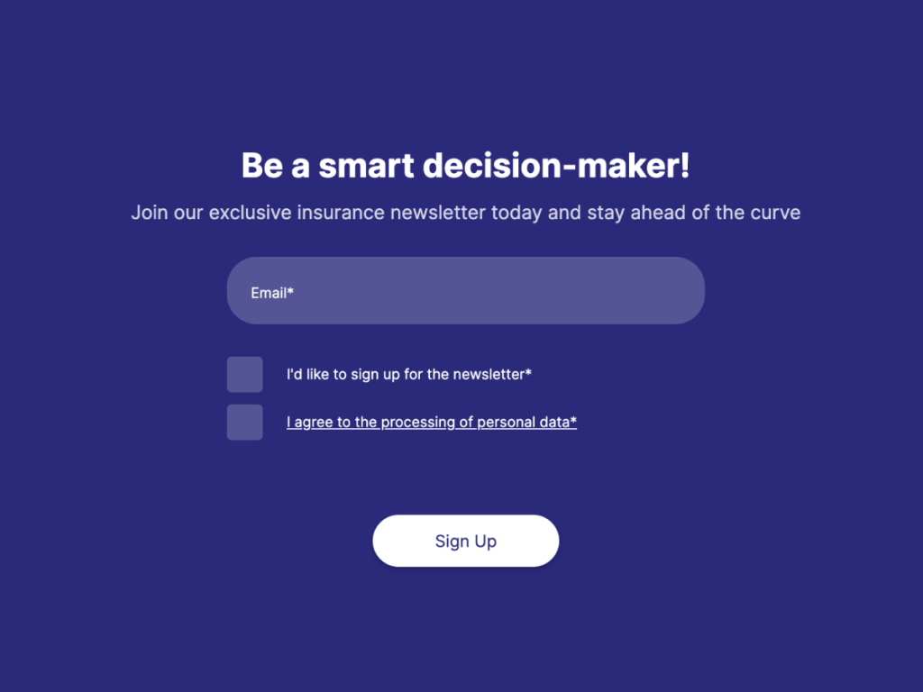
In one study I read, using more descriptive text instead of the word “submit” lead to a 24% better conversion rate. Regarding form fields, limit the number to the least amount you need to move the prospect through the sales cycle. For a newsletter subscription, you probably only need a name and an email. In this case, asking for a phone number could hurt conversions because it’s not congruent with the value they perceive they would get by filling out the form.
Get Started with Interactive Forms
With One Of Our 300+ Responsive Form Templates
Author
Shaurya Jain is a Digital Marketer who loves to dabble in growth hacking. You can check out his website here.

